How monday.com approaches reporting
monday.com reporting is built on connected work rather than a separate analytics database. Boards capture assignments, statuses, dates, budgets, and results; dashboards then combine that information into widgets that answer operational questions.
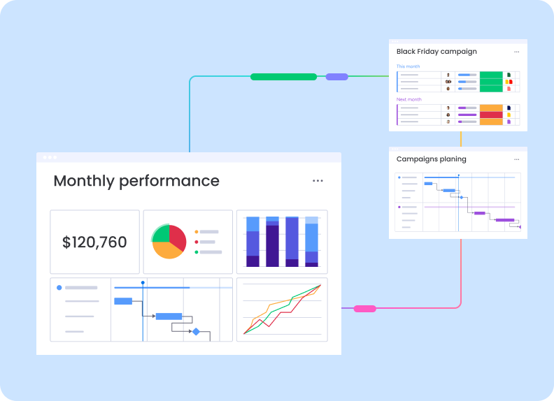
The reviewed reporting illustration connects a Monthly performance dashboard to Black Friday campaign and Campaigns planning boards. The visual link communicates an important product concept: planning records and campaign execution can feed a higher-level performance view without manual duplication.
A compact mix of KPI and visual widgets
The Monthly performance dashboard shows a headline value of $120,760 alongside a pie chart, vertical bars, a timeline-style chart, and a multi-line trend chart. This mix covers total performance, composition, comparison, schedule, and movement over time within one canvas.
That variety is useful for cross-functional reviews because each widget answers a different question. A finance lead can focus on the headline value, a marketing manager on category distribution, and a project manager on timeline dependencies — all while referencing the same connected work.
monday.com reporting is most valuable when the dashboard remains connected to the boards where teams already plan and update the work.
Campaign planning as a reporting source
The Black Friday campaign board appears to group work into this month and next month, with owners, status-like labels, and colored progress fields. The Campaigns planning board uses a Gantt-style timeline with dependencies or sequential phases.
Connecting both sources lets leadership compare current execution with longer-range planning. Instead of asking teams to maintain a presentation and a project plan separately, the reporting layer can summarize the same board data used during daily work.
Where no-code reporting reaches its limits
monday.com's visual reporting is approachable, but its quality depends on consistent column definitions across connected boards. A status named differently in two teams, incomplete numeric fields, or mixed date conventions can weaken a combined dashboard.
Organizations needing complex financial modeling, governed semantic layers, large historical datasets, or advanced statistical analysis may still need a dedicated BI platform. monday.com is better positioned for live operational reporting than for replacing an enterprise data warehouse.
Verdict
monday.com provides a practical reporting layer for teams that want decisions to stay close to active projects. Its widget mix can turn campaign and workflow boards into a readable monthly performance view without requiring analysts to build every report.
The strongest results come from governance rather than visual customization alone. Standardized fields, clear ownership, and a small set of decision-focused widgets produce more value than a large dashboard assembled from inconsistent boards.
Read our full independent review of this product.
This is an affiliate link — we may earn a commission at no extra cost to you.