What is a monday.com dashboard?
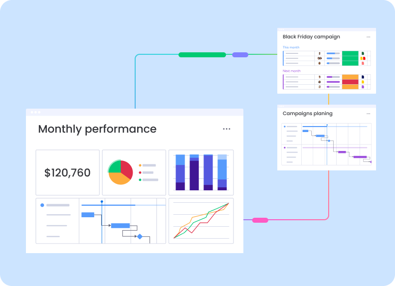
monday.com is a work operating system built around configurable boards, columns, people, dates, statuses, automations, and integrations. A dashboard sits above those boards and turns their item-level data into a visual workspace for planning and oversight.
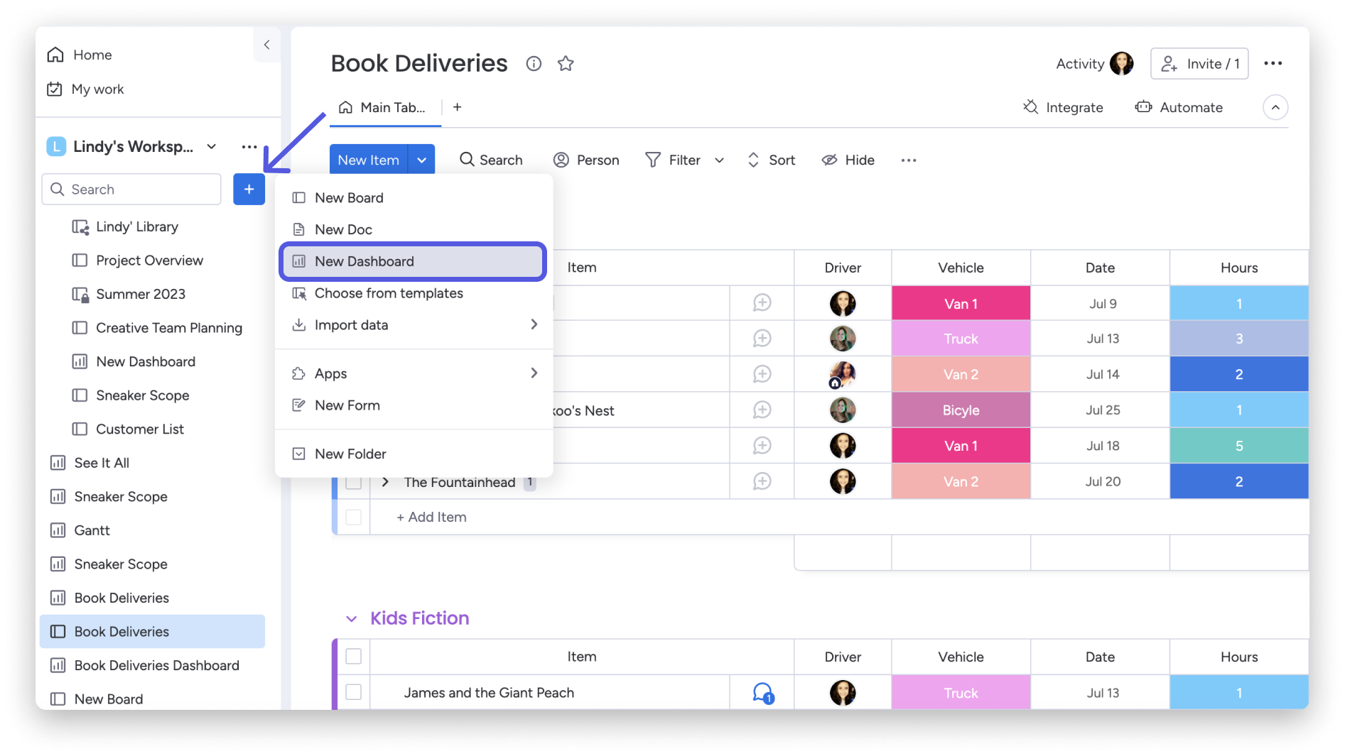
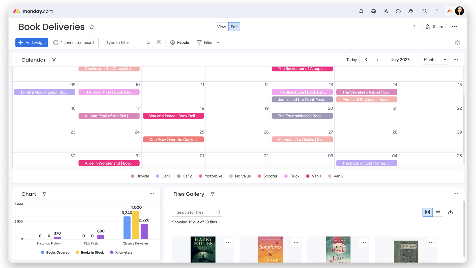
The Book Deliveries example connects one board to a dashboard containing a calendar, a chart, and a file gallery. That combination demonstrates the core dashboard proposition: the same operational records can be viewed as scheduled work, summarized metrics, and supporting assets without rebuilding the underlying data.
Calendar planning from board dates
The largest widget is a monthly calendar for July 2023. Delivery items appear on their scheduled dates and are color-coded by vehicle, with a legend for Bicycle, Car 1, Car 2, Motorbike, No Value, Scooter, Truck, Van 1, and Van 2. Teams can therefore see both timing and assigned transport at a glance.
Calendar views are particularly useful when board rows have real deadlines but a table makes workload clustering difficult to notice. In this example, multiple deliveries around July 13 and 14 are immediately visible, while sparse dates stand out without requiring a sort or spreadsheet export.
The dashboard turns delivery rows into a schedule, making date conflicts and workload clusters visible before they become operational problems.
Charts and files add operational context
The chart widget compares Books Ordered, Books in Stock, and Kilometers across Historical Fiction, Kids Fiction, and Classics Deliveries. The Classics group shows 3,240 ordered, 4,000 in stock, and 2,220 kilometers, while smaller categories remain easy to compare on the same scale.
The adjacent Files Gallery shows 19 attached files and offers search, grid or list display, and download controls. For a delivery workflow, those files could be covers, invoices, packing references, or proof-of-delivery assets. Keeping them beside the schedule and metrics reduces the need to search individual board items.
Editing, filtering, and sharing
The dashboard provides separate View and Edit modes, an Add widget action, connected-board visibility, text filtering, People and Filter controls, and a Share button. These controls support two different audiences: builders configure the dashboard, while stakeholders consume a cleaner monitoring view.
A dashboard is only as reliable as the board beneath it. Teams should standardize date, person, vehicle, and numeric columns before building widgets; inconsistent or empty values will otherwise create misleading charts and categories such as 'No Value.'
Verdict
monday.com's dashboard experience is strongest when a team already manages consistent work data in boards and needs a visual layer for managers or clients. Calendar, chart, and gallery widgets make the Book Deliveries example easier to interpret than the source table alone.
The principal limitation is setup discipline. monday.com offers flexibility rather than a fixed reporting model, so teams must define useful board fields and choose widgets intentionally. With that foundation in place, dashboards provide an approachable control center without requiring a separate BI product.
Read our full independent review of this product.
This is an affiliate link — we may earn a commission at no extra cost to you.